Evolve+Thrive
Evolve+Thrive, a community life coaching organization,
helping people through real-time in person connection.
Challenge
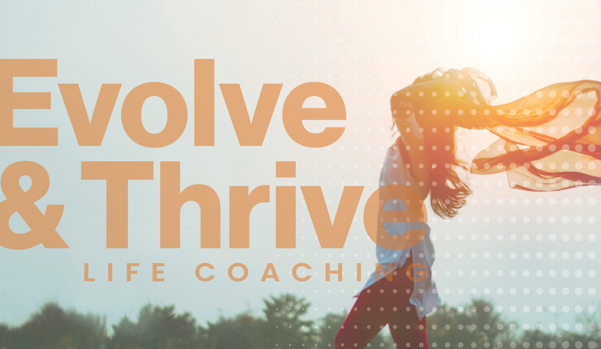
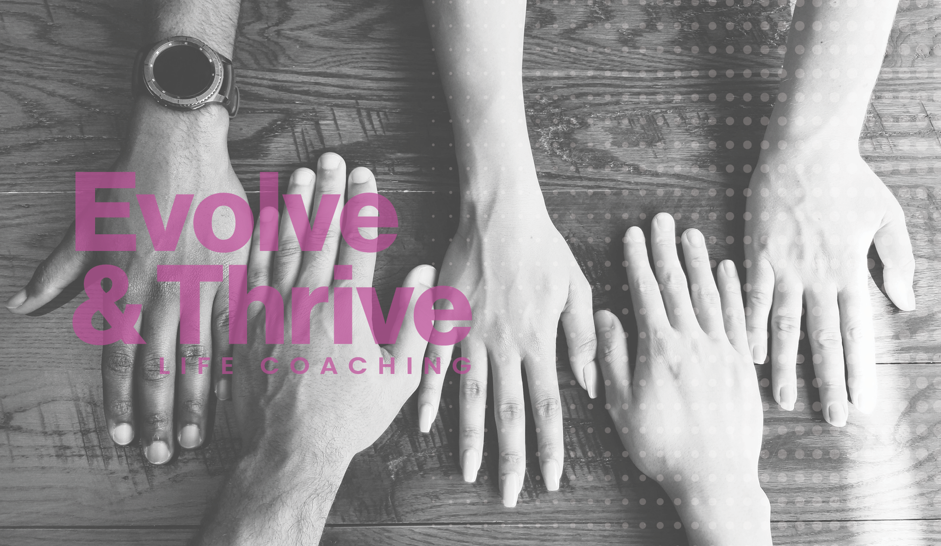
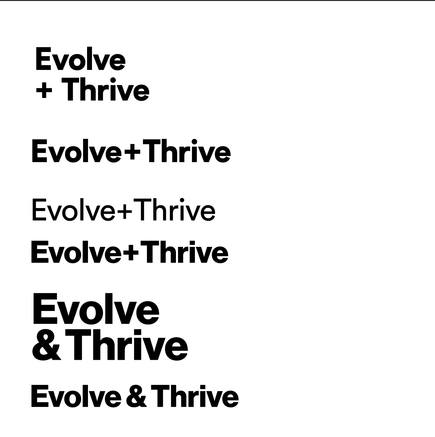
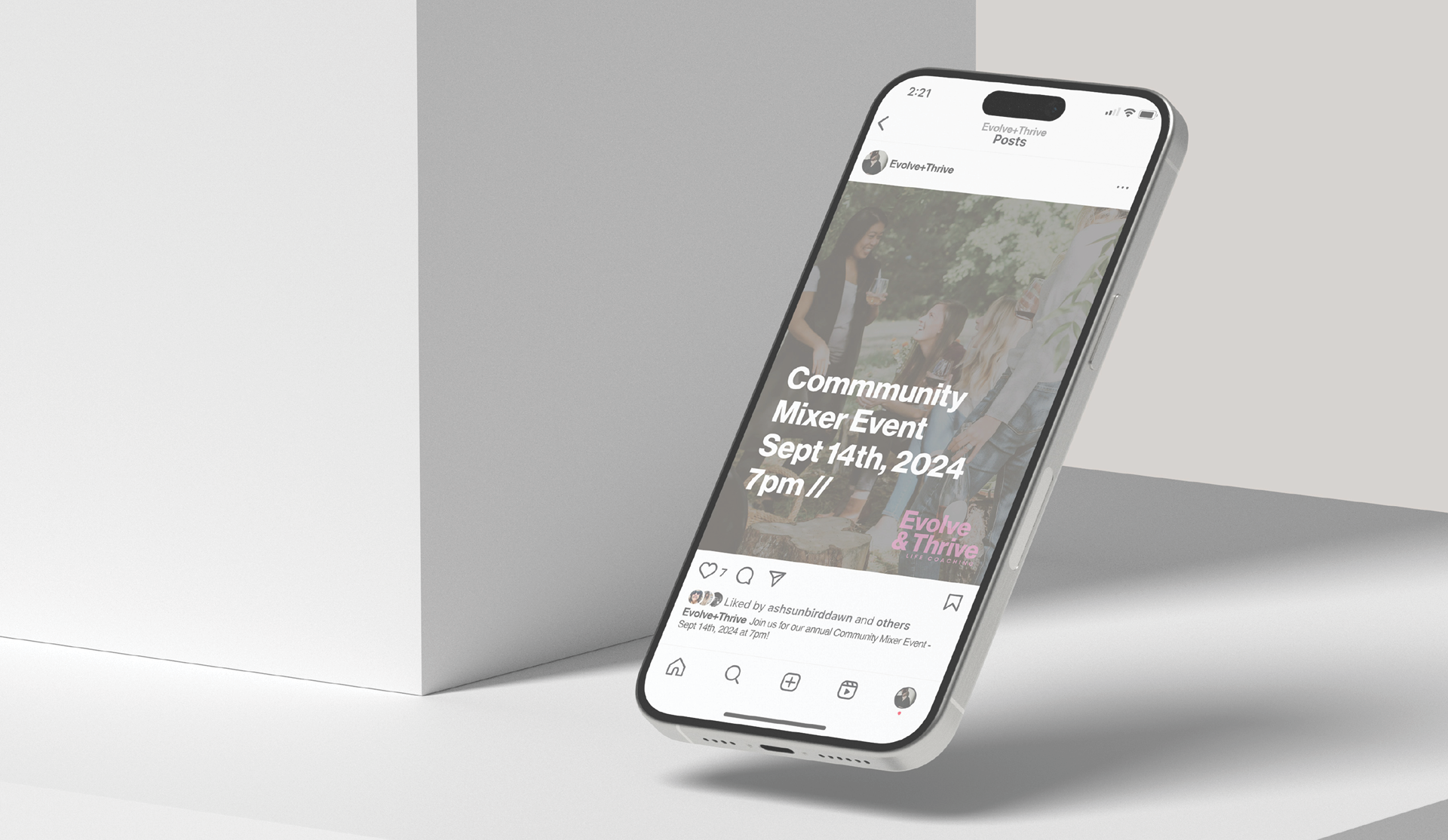
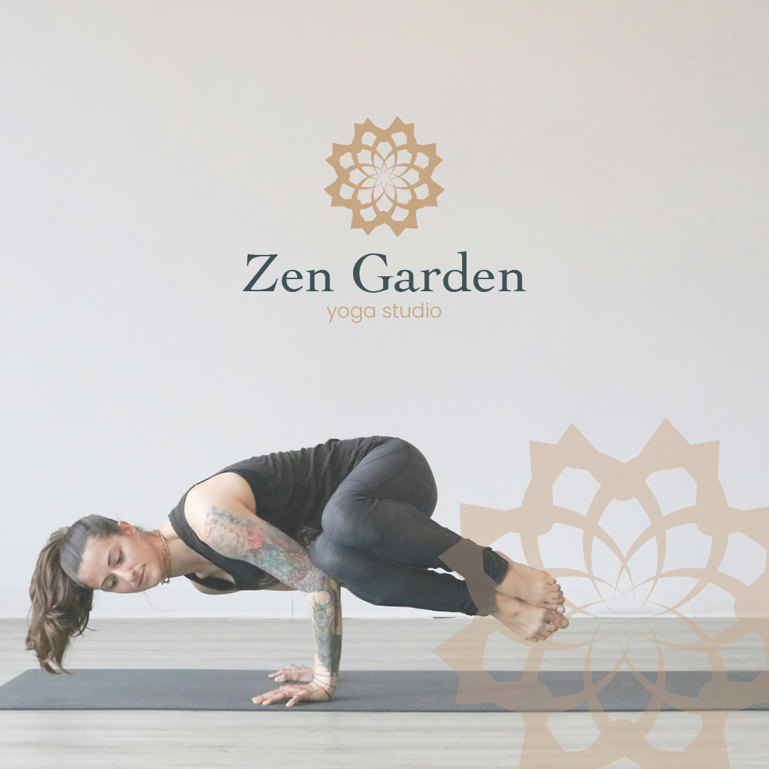
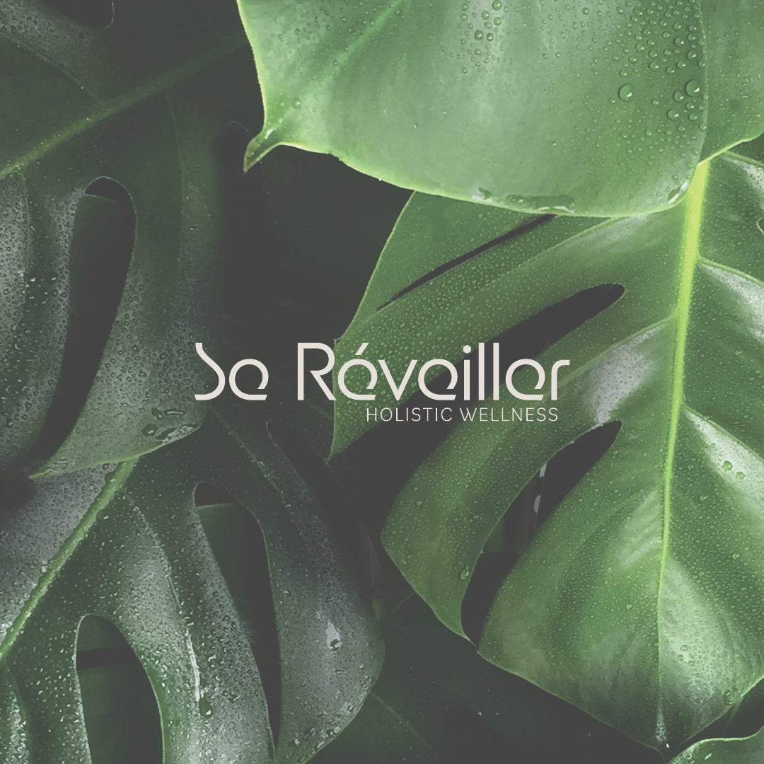
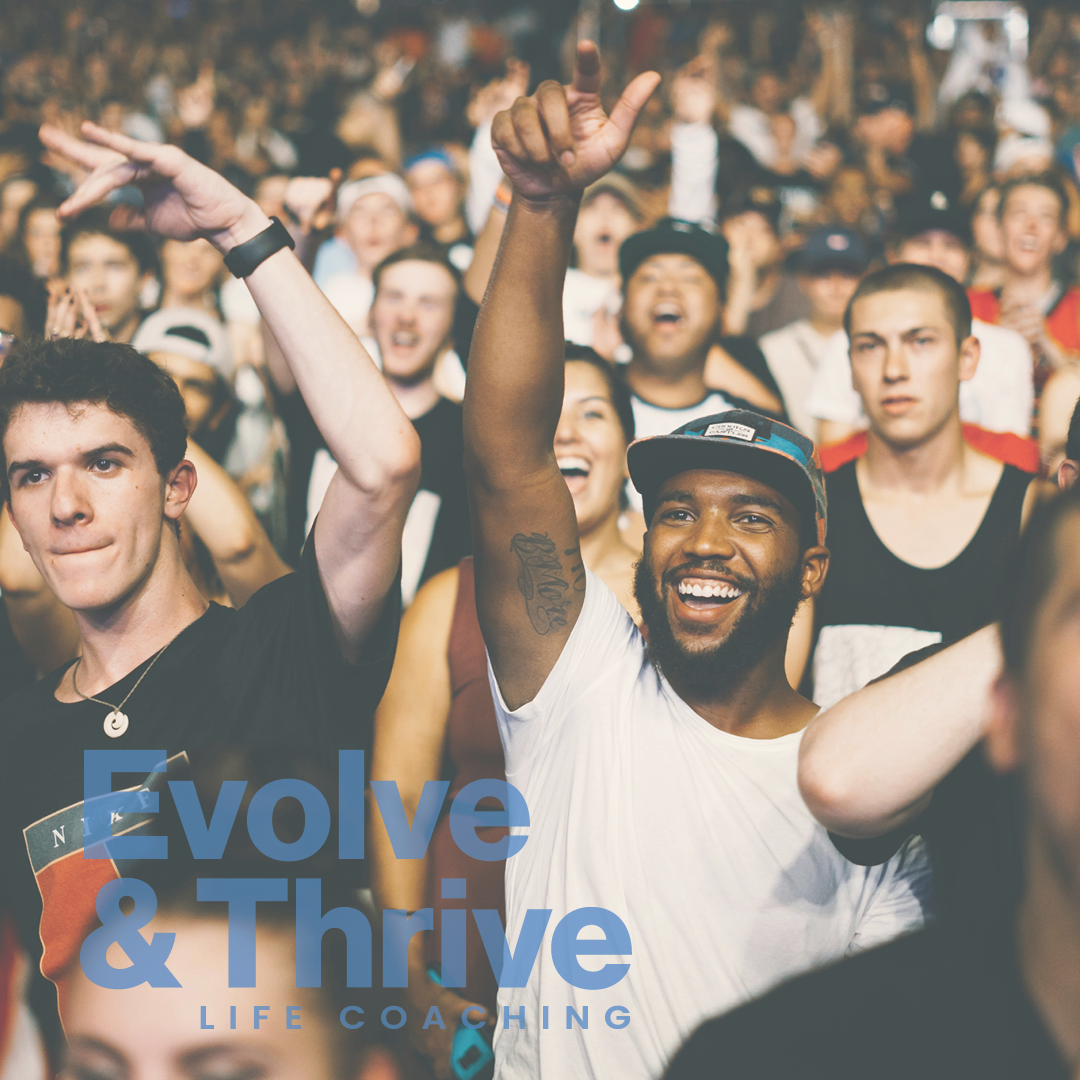
Evolve+Thrive was in need of a rebrand. They were seeking a more contemporary / modern minimalistic branding style to communicate the need for more in-person community vs the screen culture that we live in. Through font / color studies and multiple revisions, we were able to achieve a new brand everyone loves.
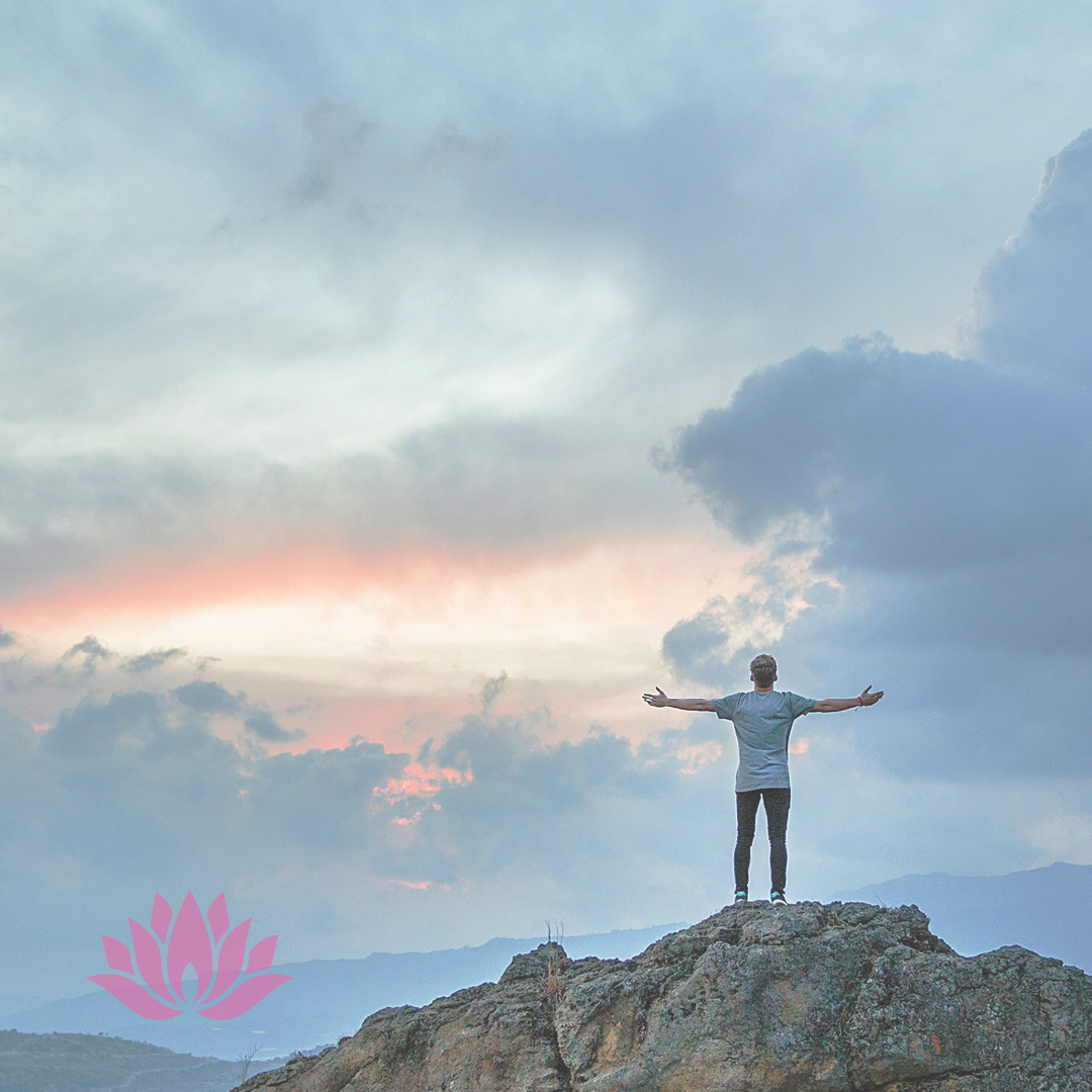
“I alone cannot change the world, but I can cast a stone across the waters to create many ripples.” – Mother Teresa
Solution
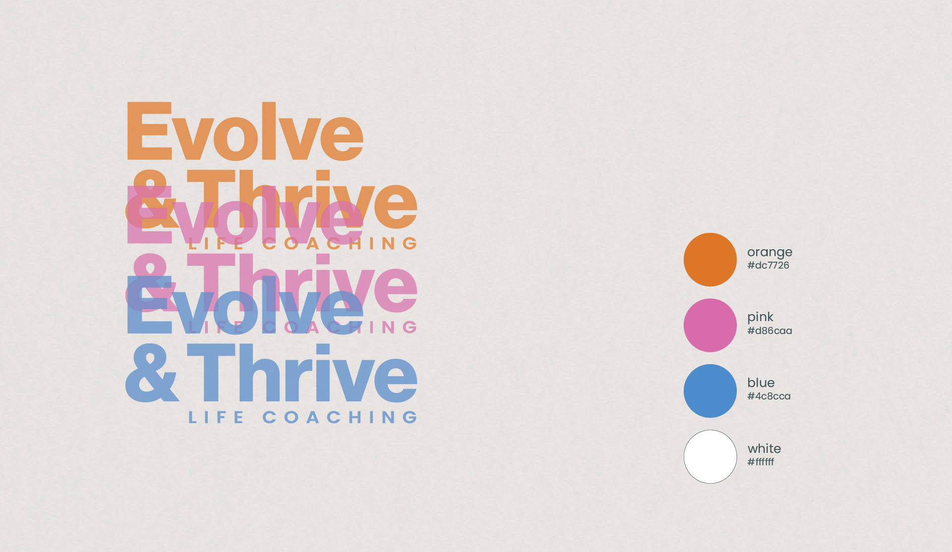
Bright colors signify optimism and progress moving forward. Bringing people together for a more, common connection while focusing on healing and inner spiritual growth among each person individually. Using the colors orange, pink, and blue – each color tied to together symbolizes unification with a modern / contemporary twist. Evolve and Thrive <3
.
Results
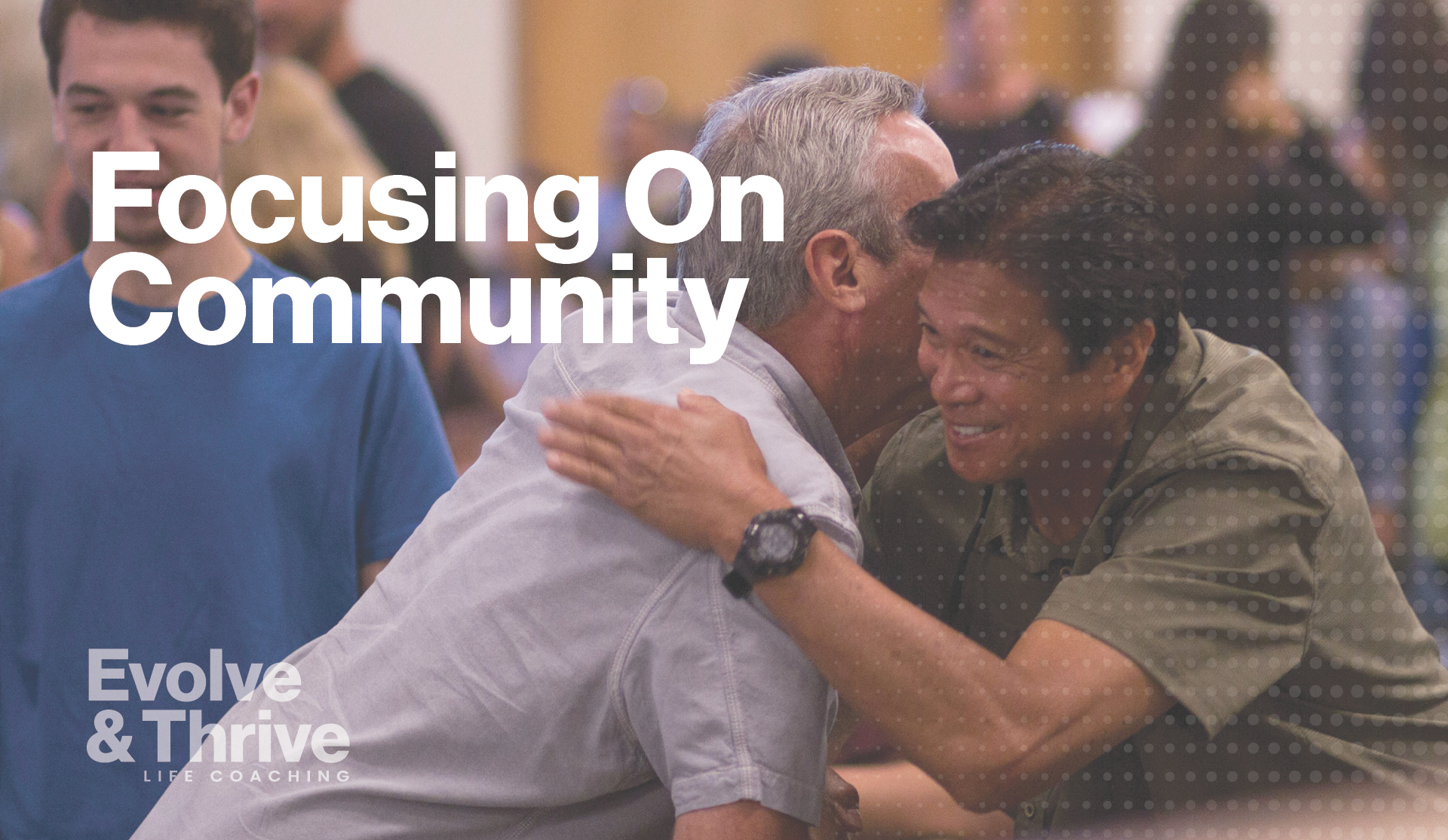
Community is everything these days. With so much of our population experiencing a loneliness epidemic, getting out of your apartment / house to interact with other incredible people in your town is so important. The rebrand was successful and excited to see this organization grow more as time moves forward.
